Colors
Primary dark gray
Usability: for regular text, headings and headlines, tables, borders
HEX: #606063
RGB: 96/96/99
CMYK: 3/3/0/61
Pantone: Cool Gray 11 C
Web Green
Usability: web-ui only, not used in print, success, positive reinforcement
HEX: #4CAF50
RGB: 76, 175, 80
CMYK: 57, 0, 54, 31
Pantone: 354 C
The brand colours are equal in status. They always appear in full tone and may not be darkened, lightened or displayed transparently.
Primary blue
Usability: accent, call to action
HEX: #2196F3
RGB: 0/167/225
CMYK: 100/26/0/12
Pantone: 2995 C
Web Amber
Usability: web-ui only, not used in print, caution, moderate warning
HEX: #FFC107
RGB: 255, 193, 7
CMYK: 0, 24, 97, 0
Pantone: 7549 C
Secondary light gray
Usability: border, frame, disabled elements, shadow
HEX: #E5E5E5
RGB: 229/229/229
CMYK: 0/0/0/10
Pantone: Cool Gray 1 C
Web Red
Usability: web-ui only, not used in print, danger, error, urgent action
HEX: #F44336
RGB: 244, 67, 54
CMYK: 0, 73, 78, 4
Pantone: 7416 C
Black
Usability: universal, text
HEX: #000000
RGB: 0, 0, 0
CMYK: 0, 0, 0, 100
Pantone: Black C
White
Usability: universal, background
HEX: #FFFFFF
RGB: 255/255/255
CMYK: 0/0/0/0
Pantone: 000C
Logo
Our logo is the face of our brand and a key element of its identity. Like many popular brands, we maintain a consistent and professional use of our logo to ensure recognition and trust.
Correct and Consistent Use:
Always use the logo in its original form and proportions.
Do not stretch, rotate, or alter its colors, fonts, or layout.
Ensure proper spacing around the logo to maintain its visibility and impact.
Trademarks and Ownership:
The logo is a registered trademark, and all rights are reserved.
We do not include the (®) symbol alongside the logo in regular applications to keep it clean and visually balanced.
Unauthorised use, modification, or reproduction of the logo is strictly prohibited.
Examples to Follow:
Like many well-known brands, we expect designers to respect the integrity of the logo. It must never be distorted or combined with other elements without approval.


Typography
Play - Font
The Play font is used for packaging and printed materials headlines, web UI headlines, and buttons.
Copyrighted by Jonas Hecksher, Playtypes, and e-types AS, with the reserved font names "Play," "Playtype," and "Playtype Sans." The font is licensed under the SIL Open Font License, Version 1.1, which allows for both commercial and non-commercial use.
HG Maru Gothic PRO - Font
HG Maru Gothic PRO is a custom font used exclusively in the logo typography. It represents our brand identity and should not be used for general text, headlines, or any other application outside the logo.
As this font is unique to our logo design, it is not to be used in marketing materials, packaging, or digital interfaces. Its purpose is to preserve the distinctiveness and recognition of our brand mark.


Lato - Font
Lato is the primary font for general text, including body copy, paragraphs, captions, and subheadings across all digital and printed materials. It ensures a clean, modern, and highly readable experience while maintaining brand consistency.
Designed by Łukasz Dziedzic, Lato is licensed under the SIL Open Font License, Version 1.1, which permits free use for both commercial and non-commercial purposes.

Lifestyle Pictures


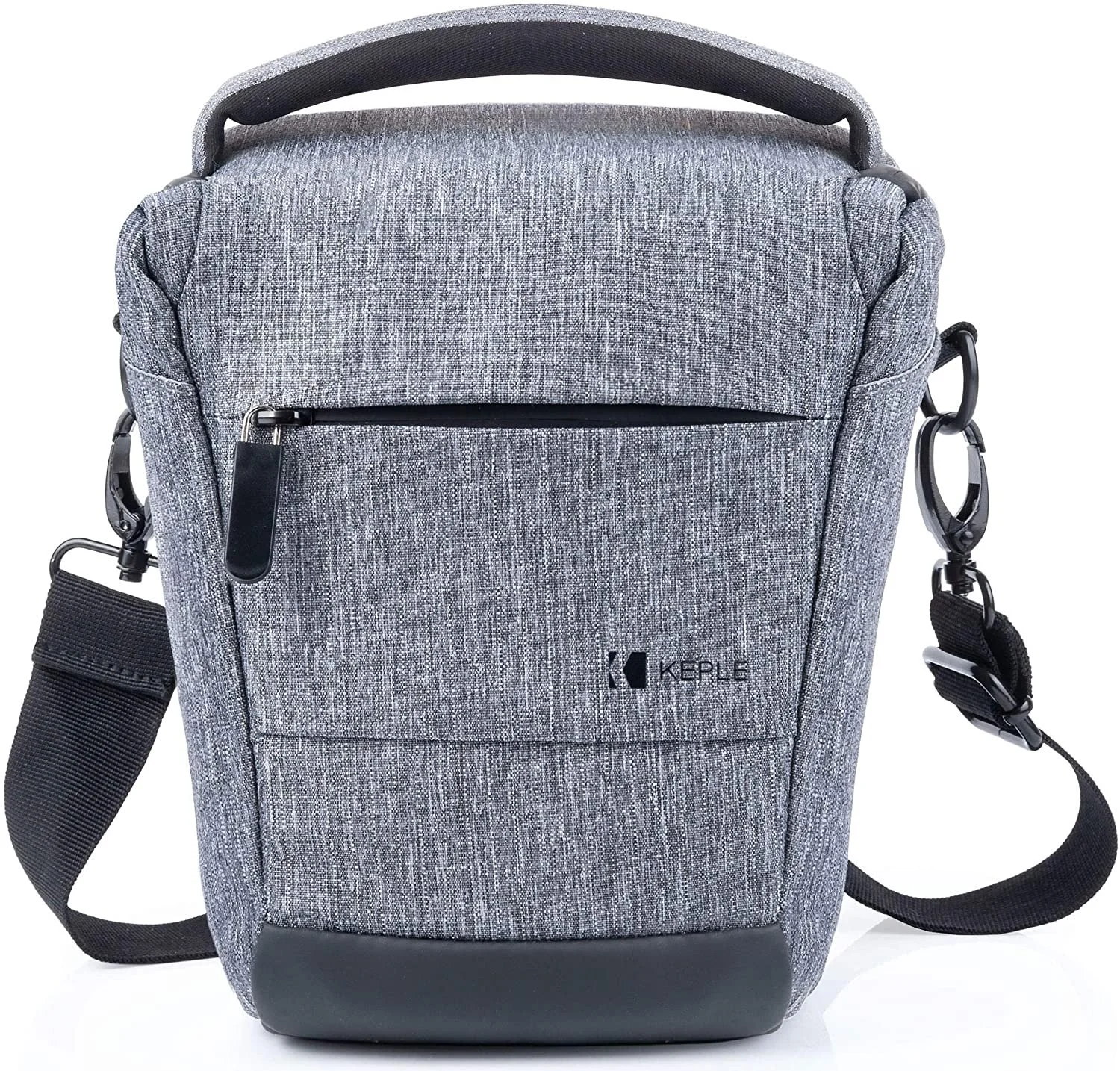

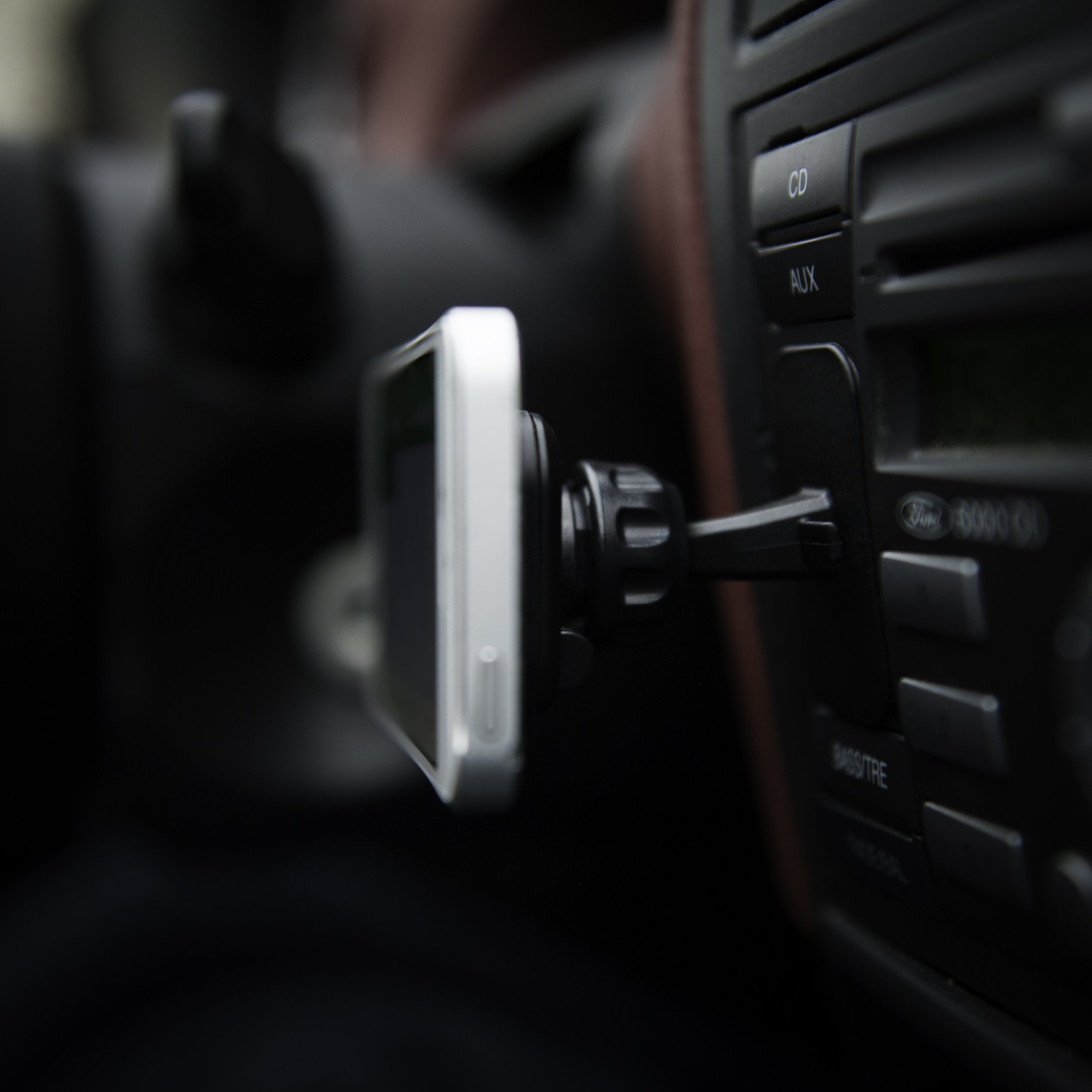


Upwork / A+ Design


Product Image Guidelines

Products must fill at least 85% of the image.
Absolutely minimum white space, cropped to the edge of the product.
Always a square, no rectangles.
Must have a pure white background.
Must be at least 2000 x 2000 px.
Must not exceed 10,000 pixels.
JPG is the preferred image format.
Lighting/brightness/saturation must be bright, crisp and eye-popping.
No shadows.
Use of a macro-lens is required for small objects.
Our company identity is to position objects in all main / hero product pictures from top-left to bottom-right (see more live examples here). 135° to 315° as per schema.
Secondary images must features details, features and specifications.
Position product angle in such a way for it to take as much as possible space.
Do not use any weird angles, only strict 0/360, 45, 90, 135, 180, 225, 270 and 315 degrees.
Main / Hero Image Examples


Secondary Image Examples
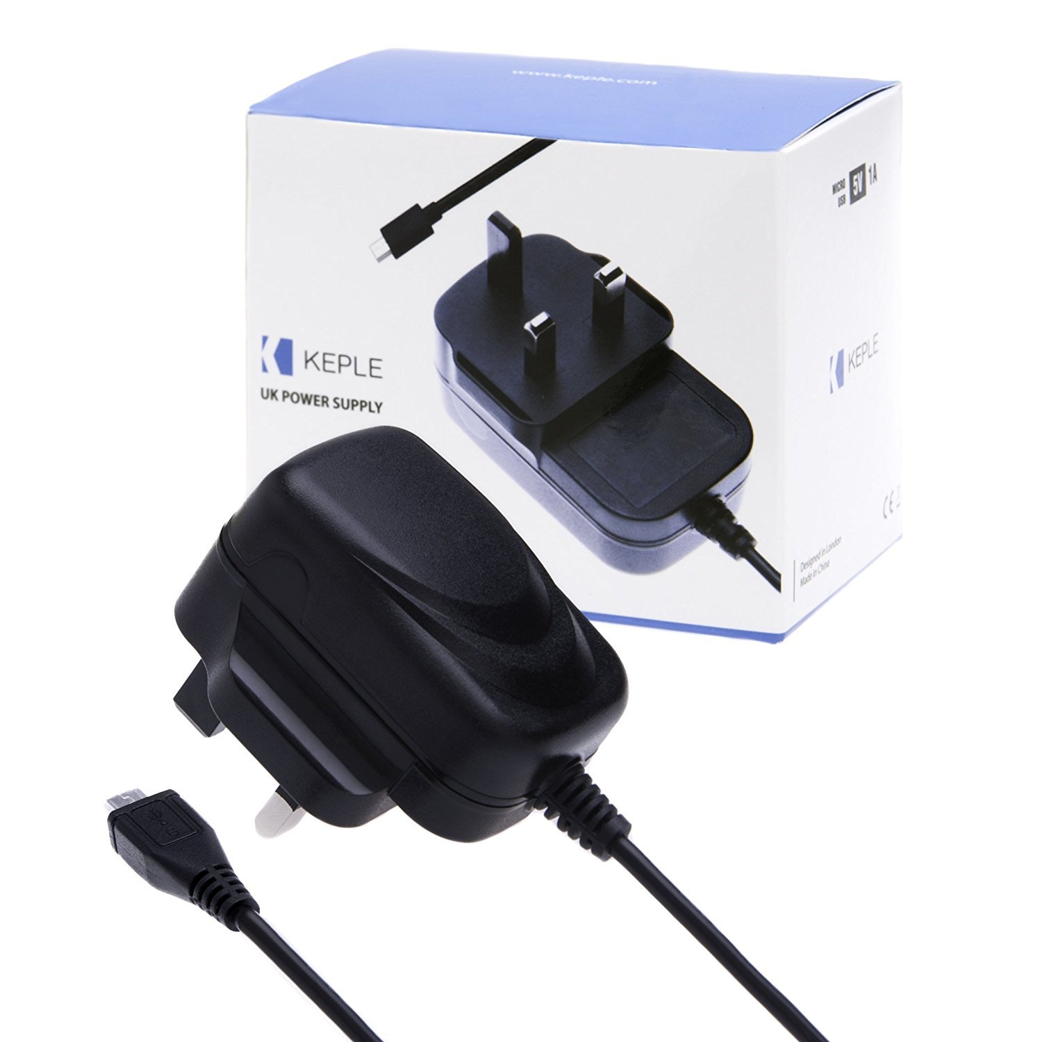
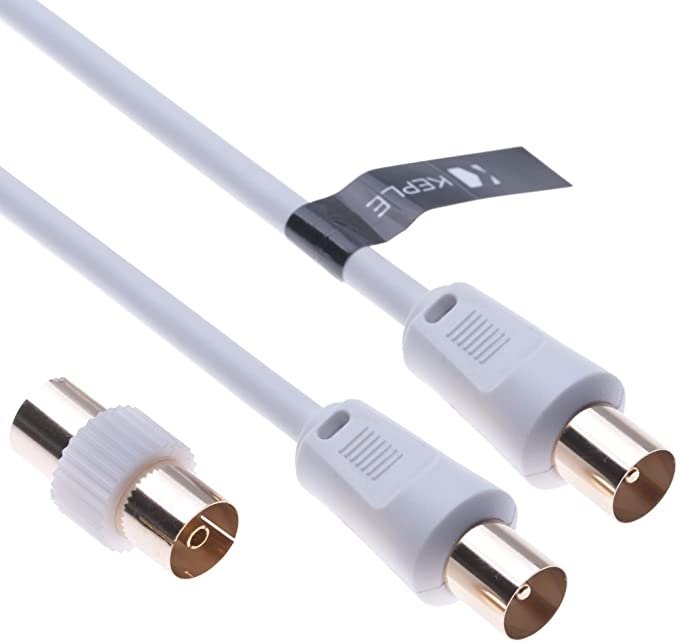
Cable/Wire
Primary / Hero Image

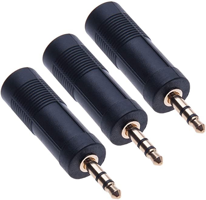
Antenna Adaptor
Primary / Hero Image

Secondary Image

Secondary Image

Secondary Image

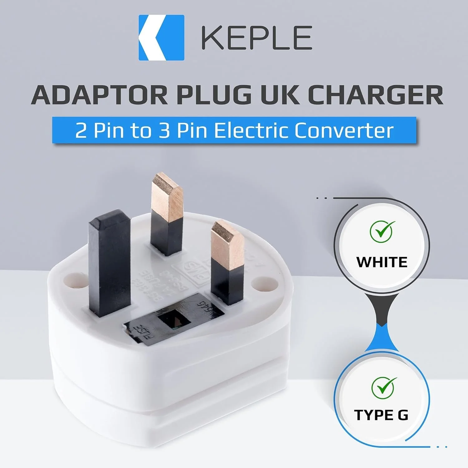
Travel Adaptor
Primary / Hero Image

Secondary Image

Secondary Image

Secondary Image

Secondary Image

Secondary Image

Secondary Image

Packaging Design Examples